In this post we are going to show you how we implement a bootstrap 4 dropdown menu with multilevel that can be shown on mouse hover instead of clicking on the menu item to display it. We start by describing the default bootstrap 4 dropddown menu and then add features to it.
Quick Demo Links:
Default Bootstrap Dropdown
Dropdowns are toggleable, contextual overlays for displaying lists of links and more. They’re toggled by clicking, not by hovering. Bootstrap’s dropdowns are designed to be generic and applicable to a variety of situations and markup structures. For instance, it is possible to create dropdowns that contain additional inputs and form controls, such as search fields or login forms.
You can simply wrap the dropdown’s toggle (your button or link) and the dropdown menu within .dropdown, or another element that declares position: relative;. Dropdowns can be triggered from <a> or <button> elements to better fit your potential needs. The following demo page showing you variety of Bootstrap dropdown examples: Default Bootstrap Dropdown Examples Page.
Showing Bootstrap Dropdown On Mouse Hover
The simple way to display bootstrap dropdown menu on mouse hover instead of clicking is to listen on mouseenter event on .dropdown-toggle class and then fire click event on this element. Consider the following default bootstrap dropdown menu HTML demo code that taken from above JavaTMP Bootstrap dropdown examples:
<div class="btn-group">
    <button class="btn btn-primary dropdown-toggle" data-toggle="dropdown" aria-expanded="false">
        Actions
    </button>
    <ul class="dropdown-menu">
        <li><a class="dropdown-item clearfix" href="javascript:;">Action</a></li>
        <li><a class="dropdown-item" href="javascript:;">Another action</a></li>
        <li><a class="dropdown-item" href="javascript:;">Something else here</a></li>
        <li class="dropdown-divider"></li>
        <li><a class="dropdown-item" href="javascript:;"> Separated link</a></li>
    </ul>
</div>
To make the above default bootstrap dropdown menu shown when mouse hover on dropdown-toggle button when add the following Javascript code:
$(".dropdown-toggle").on("mouseenter", function () {
    // make sure it is not shown:
    if (!$(this).parent().hasClass("show")) {
        $(this).click();
    }
});
That is it. It will simulate the click when mouse hover and enter on the Bootstrap dropdown component and provides standard native bootstrap method of trigger standard dropdown events. The following link show you a live demo of how to implement a Bootstrap dropdown on mouse hover demo page.
Now, if you want an extra functionality like hiding and closing dropdown when mouse leave it. you can listen for mouseleave event on .dropdown or .btn-group parent element and fire click on dropdown-toggle. The following Javascript code shows you how you can hide dropdown when mouse leave it:
$(".btn-group, .dropdown").on("mouseleave", function () {
    // make sure it is shown:
    if ($(this).hasClass("show")){
        $(this).children('.dropdown-toggle').first().click();
    }
});
Now, we continue extending default Bootstrap dropdown to support a multilevel menu item instead of single level.
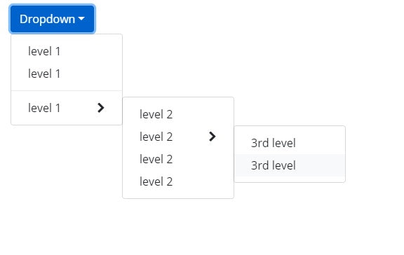
Implements Multilevel Bootstrap 4 Dropdown Menu
Native Bootstrap's dropdown does not support submenu and multilevel menu. In this section we extends default Bootstrap 4 dropdown menu to support submenu and multilevel menu by simply using CSS styling.
1. Introducing .dropdown-submenu class
We create a .dropdown-submenu class that will be parent of any .dropdown-item that you want to show as a submen. So The following default Bootstrap dropdown-item:
<li><a class="dropdown-item" href="#">level 1</a></li>
Become the following after updating it with second dropdown menu:
<li class="dropdown-submenu">
    <a class="dropdown-item" tabindex="-1" href="#">level 1</a>
    <ul class="dropdown-menu">
        <li><a class="dropdown-item" tabindex="-1" href="#">level 2</a></li>
    </ul>
</li>
The main modification were adding .dropdown-submenu to .dropdown-item's parent and add dropdown-menu block inside it that will become the second level of Bootstrap dropdown.
The styling rule for new .dropdown-submenu is:
.dropdown-submenu {
    position: relative;
}
2. Add cursor indicator to submenu link item
We updated the :after pseudo-elements to show cursor indicator using Font Awesome:
.dropdown-submenu > a.dropdown-item:after {
    font-family: FontAwesome;
    content: "\f054";
    float: right;
}
You could use an indicator without external font:
.dropdown-submenu > a.dropdown-item:after {
    content: ">";
    float: right;
}
3. Changing dropdown inside dropdown-submenu
The updated styling for .dropdown-menu inside .dropdown-submenu is:
.dropdown-submenu > .dropdown-menu {
    top: 0;
    left: 100%;
    margin-top: 0px;
    margin-left: 0px;
}
4. Showing submenu when mouse hover on submenu item
The following style to make submenu shown when mouse hover on .dropdown-submenu item:
.dropdown-submenu:hover > .dropdown-menu {
    display: block;
}
The following link show you a live demo for multilevel Bootstrap 4 dropdown menu on hover.